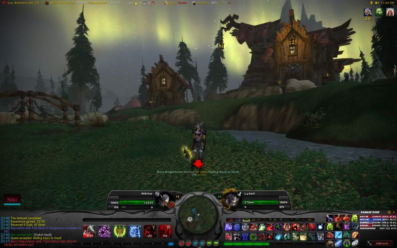
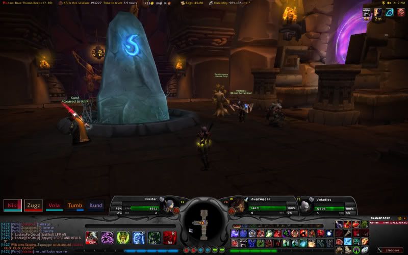
 The guts of this UI is SpartanUI which I haven't used before, but it's a nice change from Xperl or Pitbull if you ask me. I had to do a bit of customization because even though SpartanUI is designed for widescreens, the buttons and text was far too tiny on my 24 inch 1920x1200 screen.....
 ... so I changed some scaling, made some big spam buttons on the left, and installed all my other favourite addons like omen and recount, quest helper and scrolling combat text...
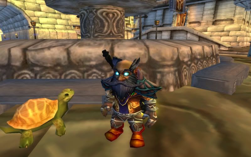
 This is little Zupa the gnome DK with Speedy...
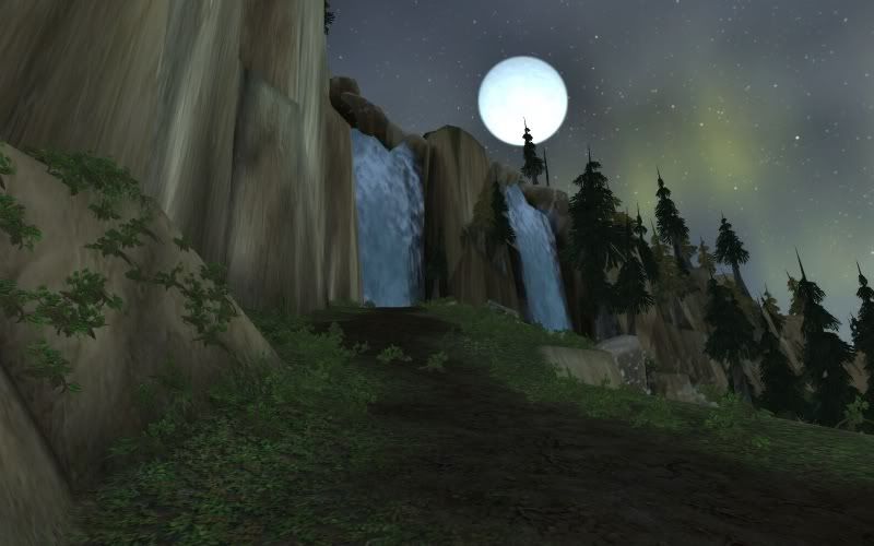
And this is just pretty ! Should be pretty easy to guess where this was taken, it was also the first place in WotlK where I decided to stop and take a picture :)


1 comment:
why didn't someone tell me how retarded this looks on internet explorer?
I'm hoping its just coz nobody uses that rubbish browser in this enlightened day and age.
I'm off to play html and get it fixed.
PS: use firefox it's better.
Post a Comment